Dashboard Overview
Your home base for managing ads
Learn what every part of the AdWhiz dashboard does. This is your home base — the first screen you see after signing in.
What is the Dashboard?#
The dashboard is the first thing you see when you sign in to AdWhiz. Think of it like the home screen on your phone — it shows you the most important information at a glance.
From here you can see how your ads are doing, what needs fixing, and what the AI suggests you change. You don't need to click anywhere else to get the big picture.
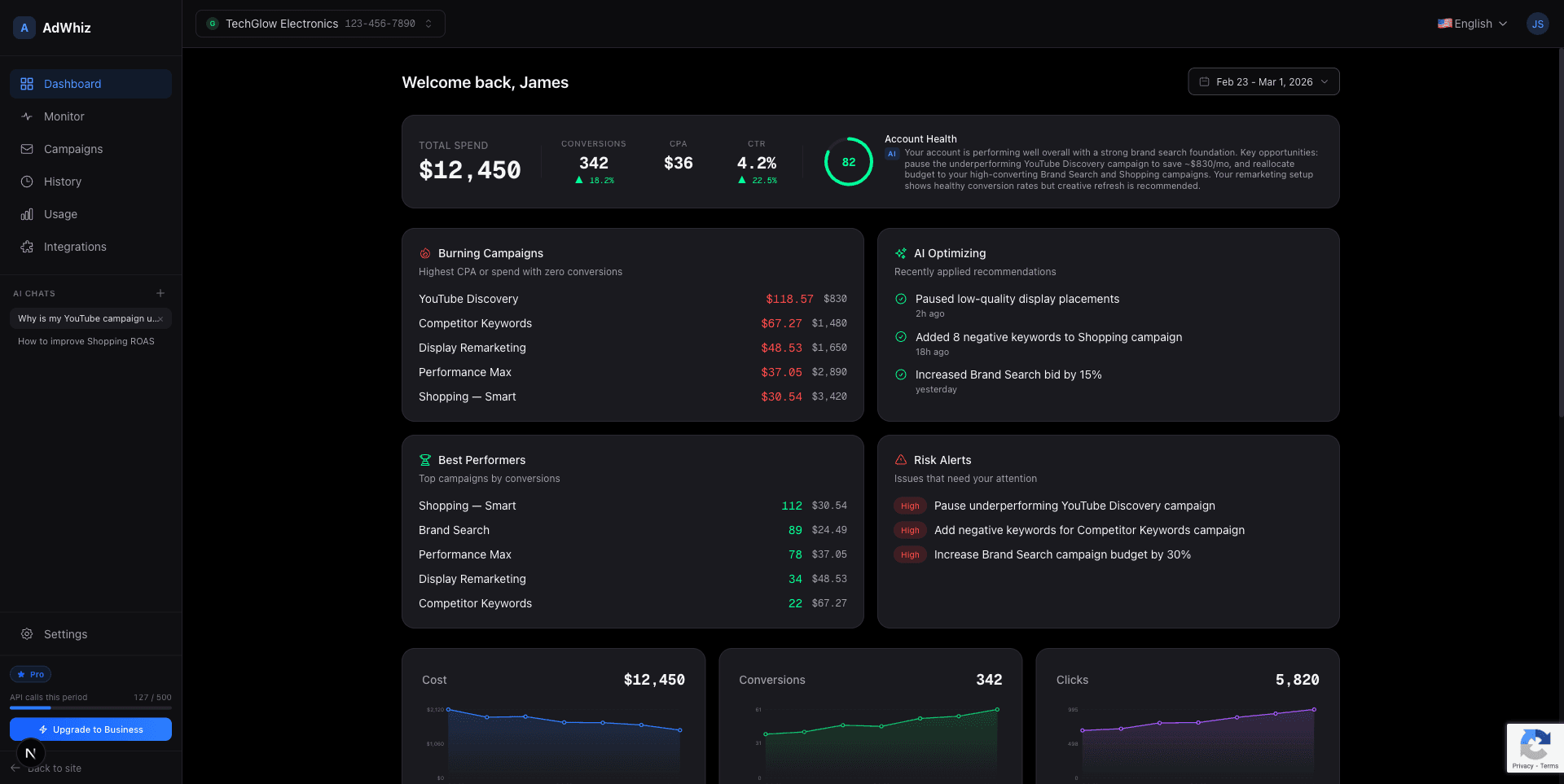
Top Banner — Your Key Numbers#
At the very top of the dashboard you'll see a row of numbers. These are the most important metrics (measurements) for your ads:
| Number | What it means |
|---|---|
| Total Spend | The total amount of money you've spent on ads during the selected time period |
| Conversions | How many times someone did what you wanted — like making a purchase, filling out a form, or signing up |
| CPA | Cost Per Action — how much money it costs you, on average, to get one conversion |
| CTR | Click-Through Rate — the percentage of people who saw your ad and clicked on it |
| Health Score | A number from 0 to 100 that tells you how healthy your ads are. Higher is better. |
The Health Score is shown as a colored circle. Green means your ads are doing well. Yellow means there's room to improve. Red means you need to take action soon.

The Four Summary Cards#
Below the top banner you'll see four cards. Each one highlights a different part of your ad account:
Burning Campaigns
These campaigns are spending money but not getting good results. They're "burning" through your budget. You should look at these first.
AI Optimizing
These are the changes the AI is currently working on or has recently suggested. It shows you what's being improved right now.
Best Performers
Your winning campaigns! These ads are getting great results for the money you spend. You might want to put more budget into these.
Risk Alerts
Things that need your attention soon. For example, a campaign might be close to running out of budget, or a keyword might be wasting money.
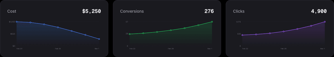
Charts — See Trends Over Time#
Below the cards you'll find charts. These show how your spending and results change over days, weeks, or months. Lines going up usually mean more activity. You can hover over any point on the chart to see exact numbers.
Charts help you spot patterns. For example, you might notice that your ads perform better on weekdays than weekends. Or you might see that a recent change made your costs go down — that's a good sign!
Optimization Feed — AI Suggestions#
At the bottom of the dashboard you'll see the Optimization Feed. This is a list of suggestions from the AI. Each suggestion tells you one thing you can do to improve your ads.
The most important suggestions appear at the top. You can click on any suggestion to learn more, or click "Apply" to let AdWhiz make the change for you. See the AI Recommendations page for full details.
Change the date range
You can change the time period at the top-right of the dashboard. For example, you can look at the last 7 days, last 30 days, or a custom range. This changes all the numbers and charts on the page so you can compare different periods.
Getting Around the Dashboard#
On the left side of the screen you'll see a sidebar menu. This lets you jump to other pages like the Campaign List, Monitor View, or AI Chat. You can collapse the sidebar by clicking the arrow icon to give yourself more room.
Multiple accounts?
If you've connected more than one ad account, you can switch between them using the account selector at the top of the sidebar. Each account has its own dashboard with its own numbers.